Country Folk vs City Slickers
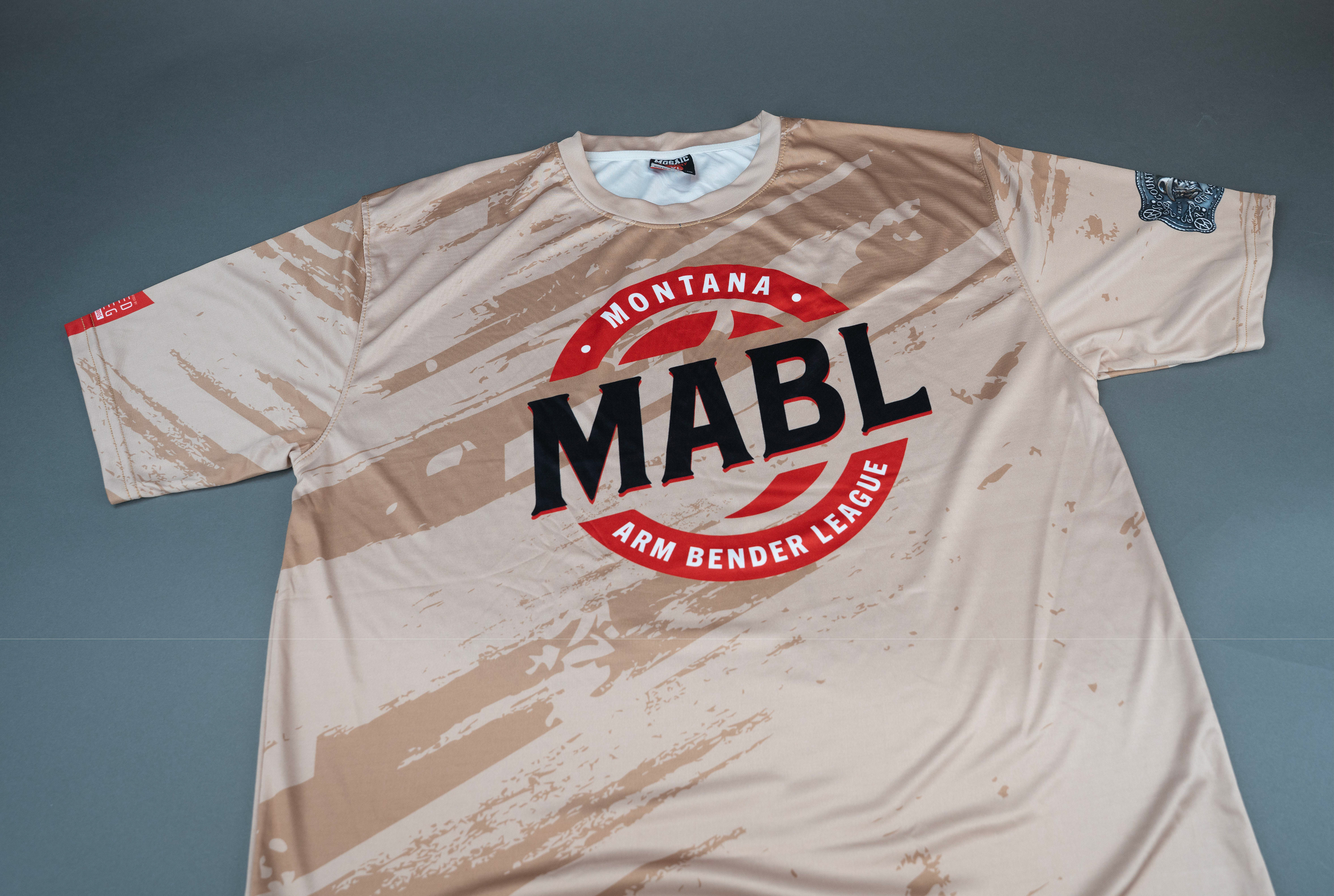
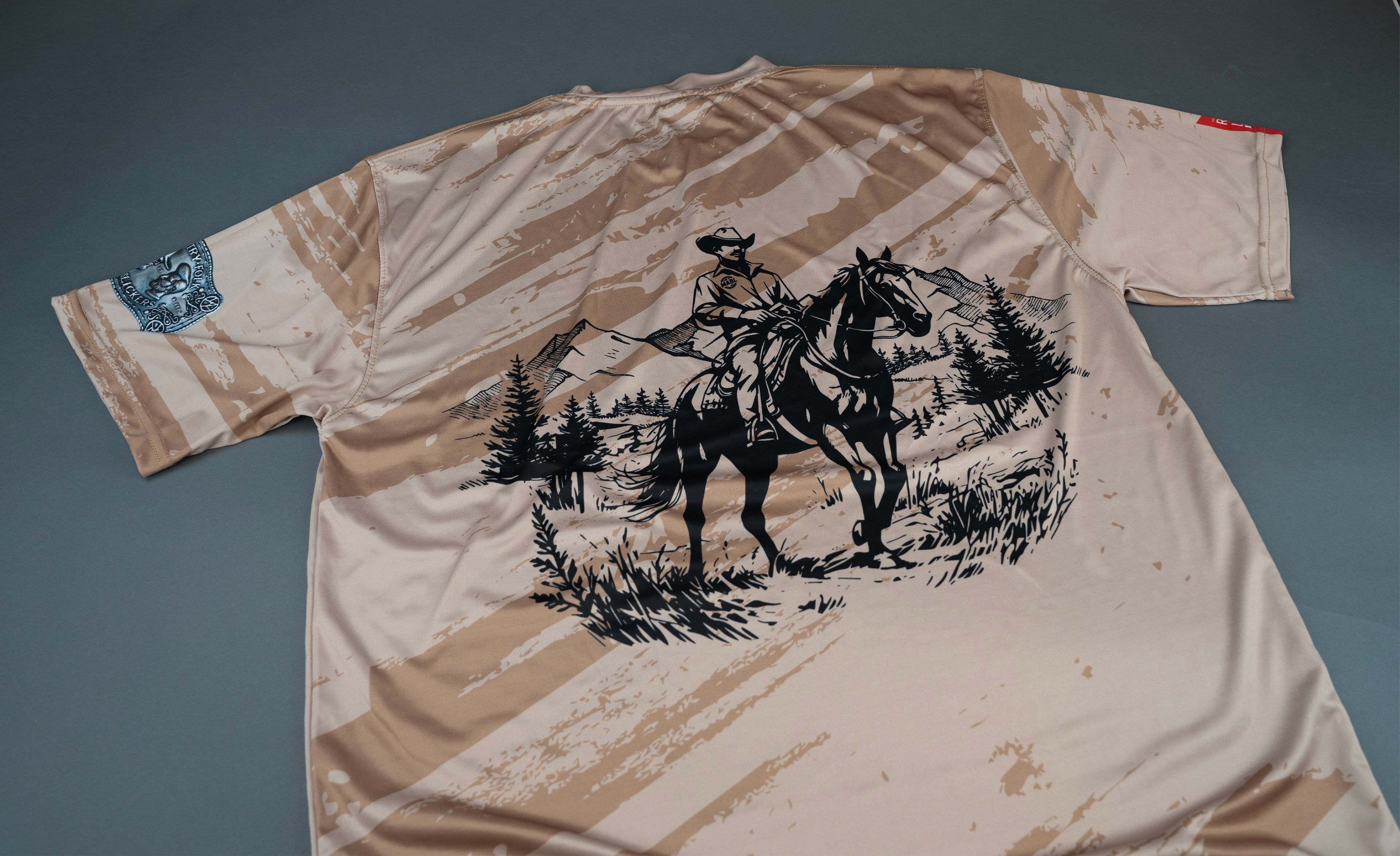
Montana Arm Bender League logo design

With the start of MABLs new event "Country Folk vs City Slickers" a logo for the event as well as merchandise and indicator of teams were needed. MABL reached out to Orca Killer Creative for help and with that came this journey of the belt buckle.

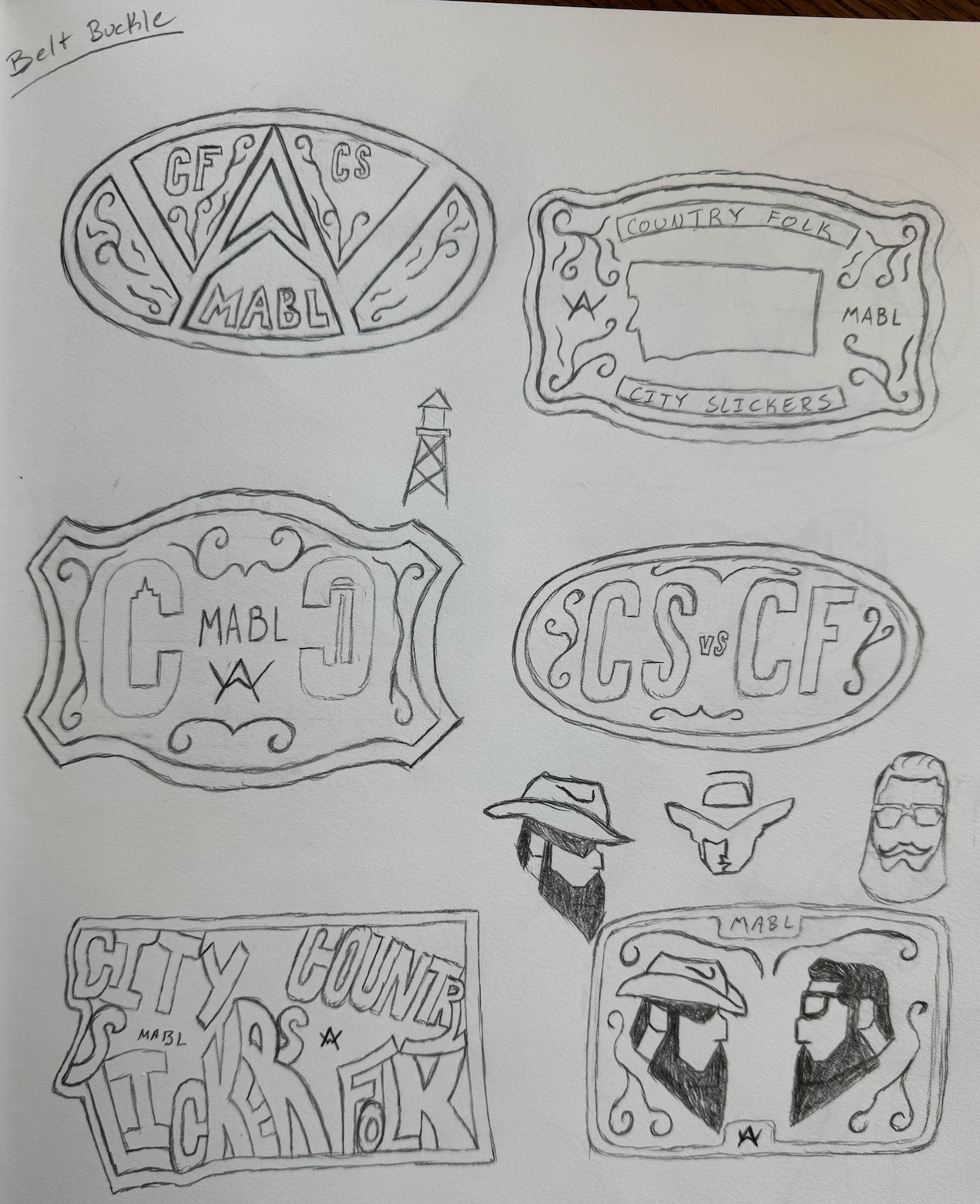
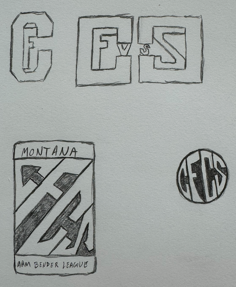
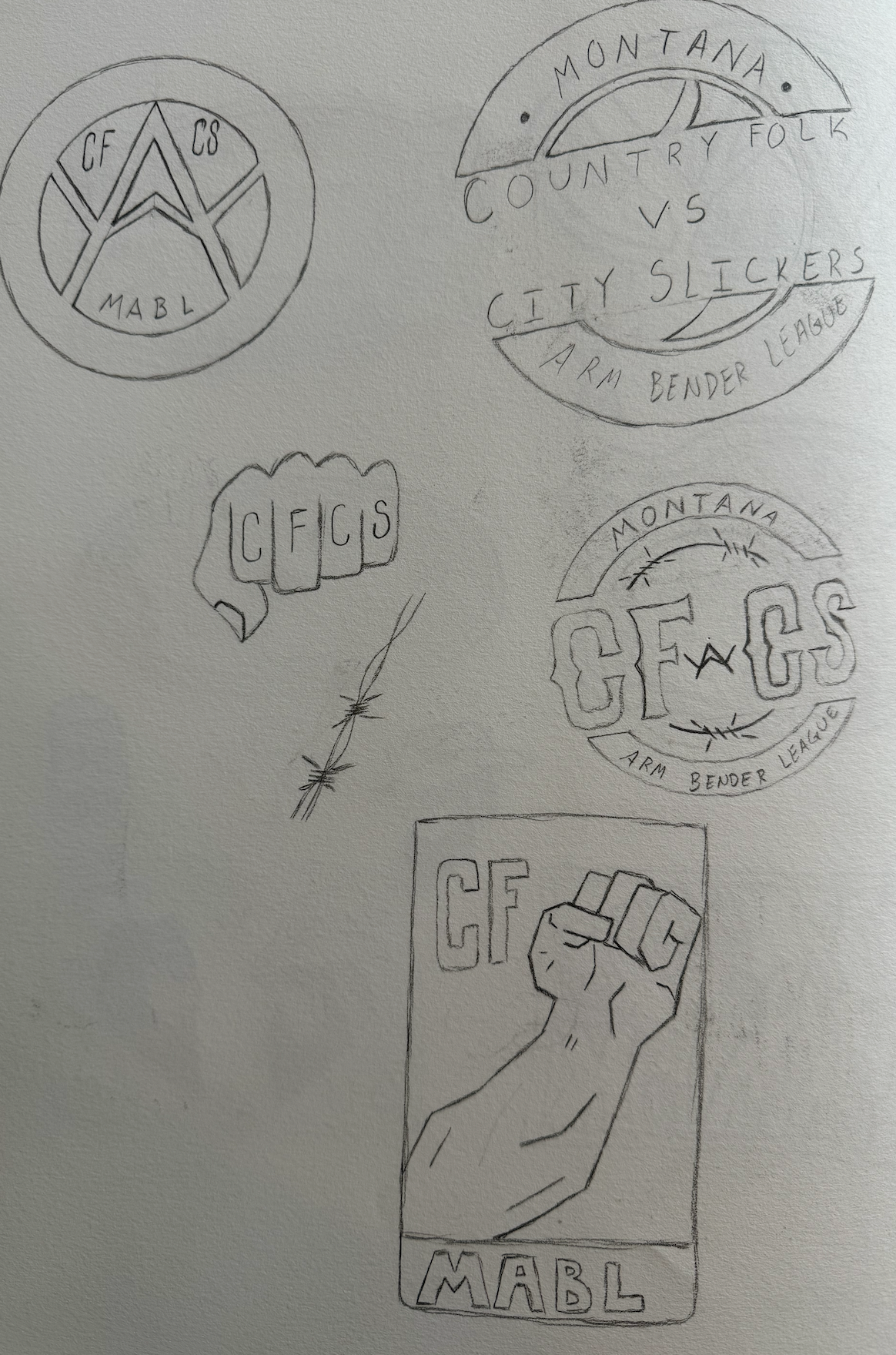
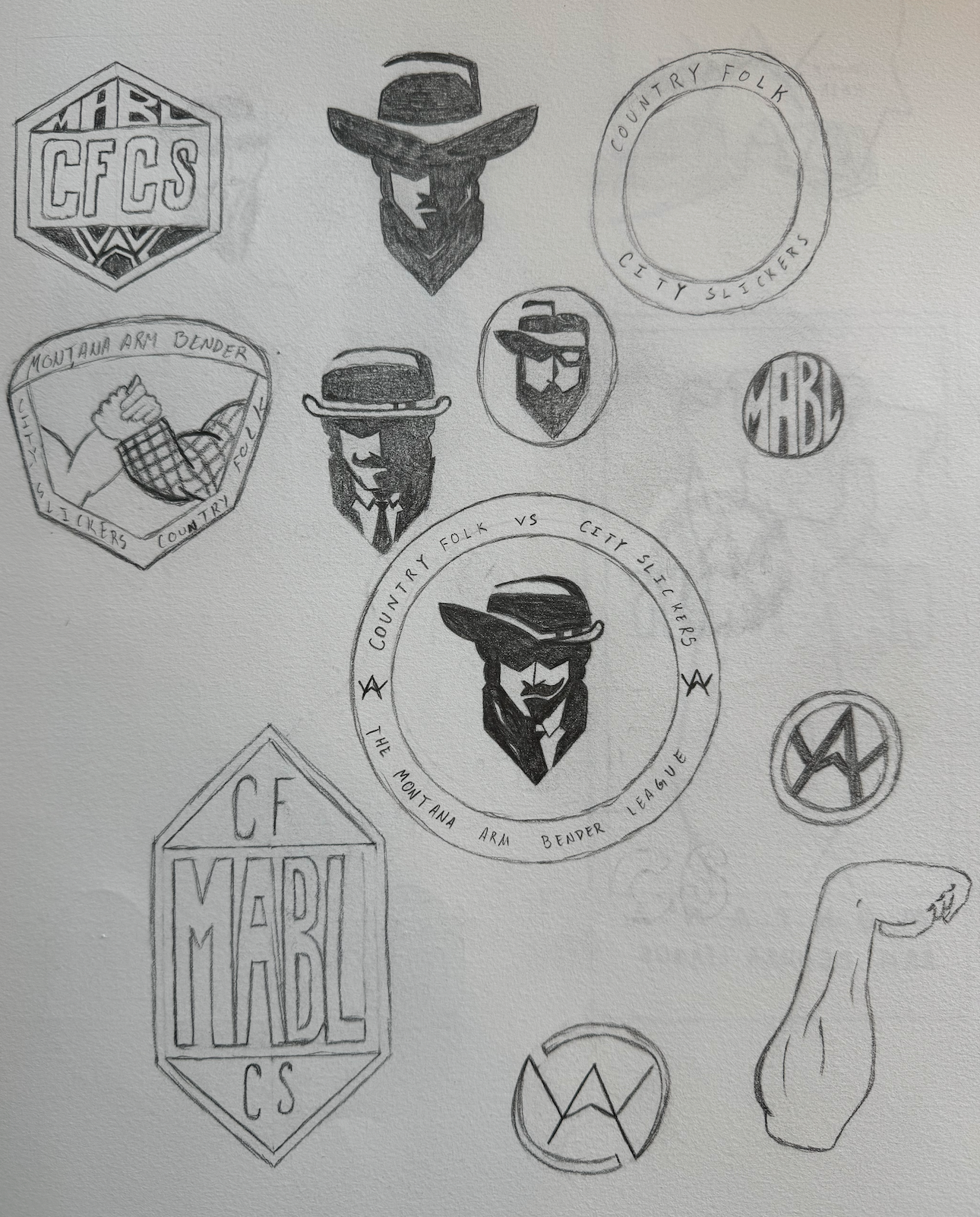
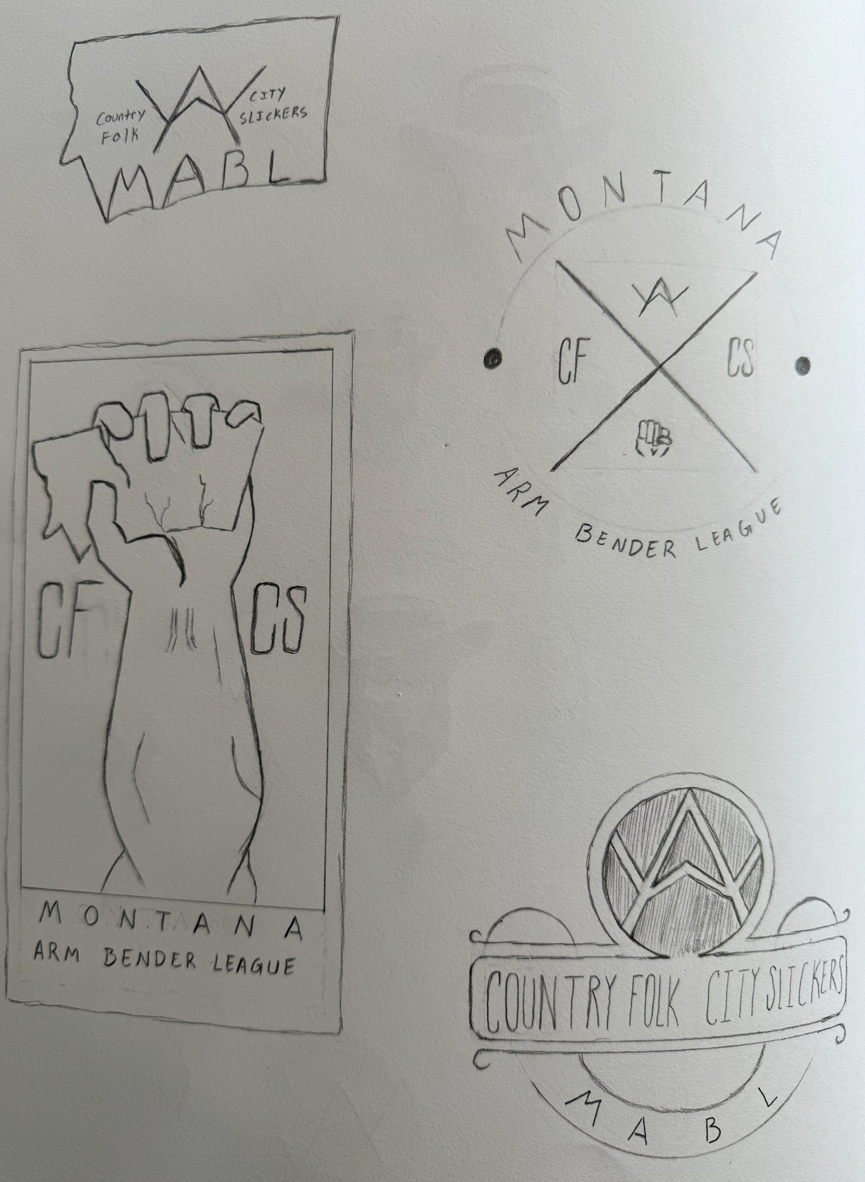
Throughout the concept phase belt buckles, iron brands, and fists were the main source of inspiration and reference for the logo. The style of men from the late 1800's and early 1900's were also incorporated for a more visual rather than text look.
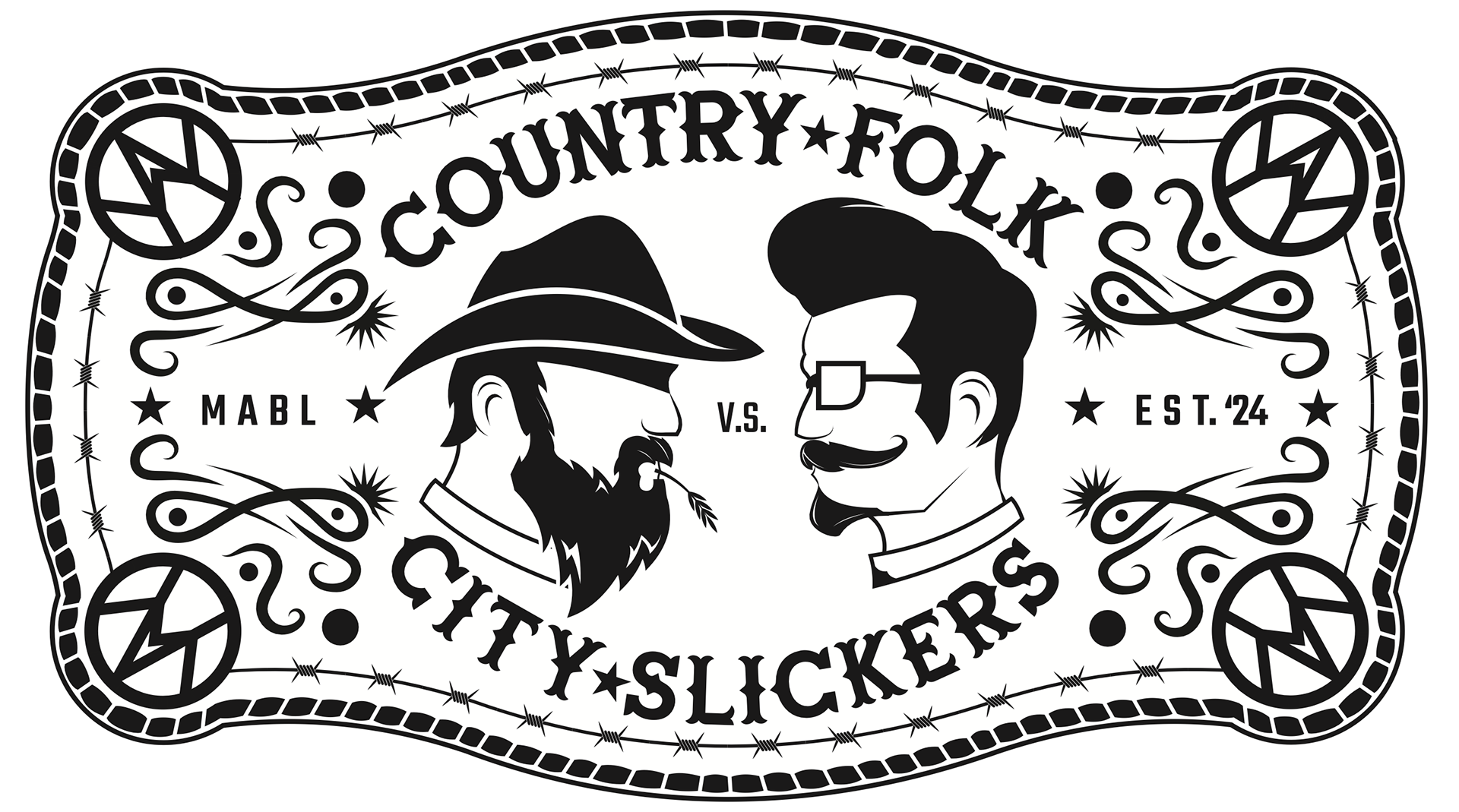
Here are the logos that were made for the client to choose from for their event, however they didn't choose one, they chose two. MABL loved the idea of the belt buckle as the main logo and the iron branding as a secondary logo.
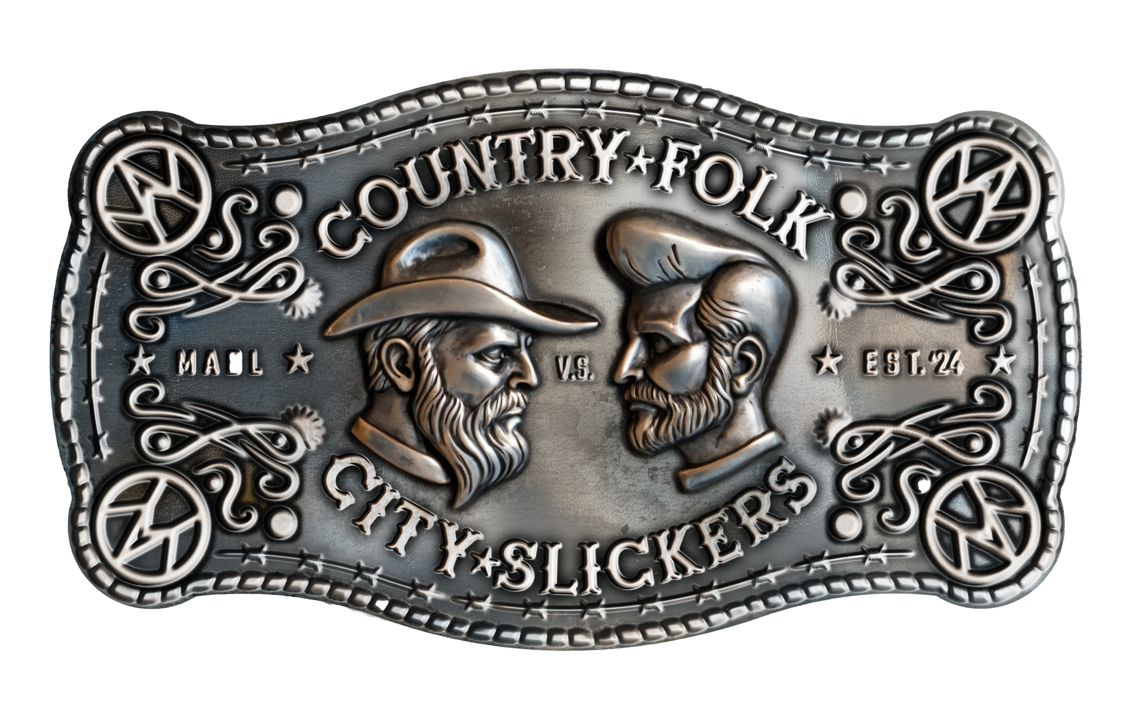
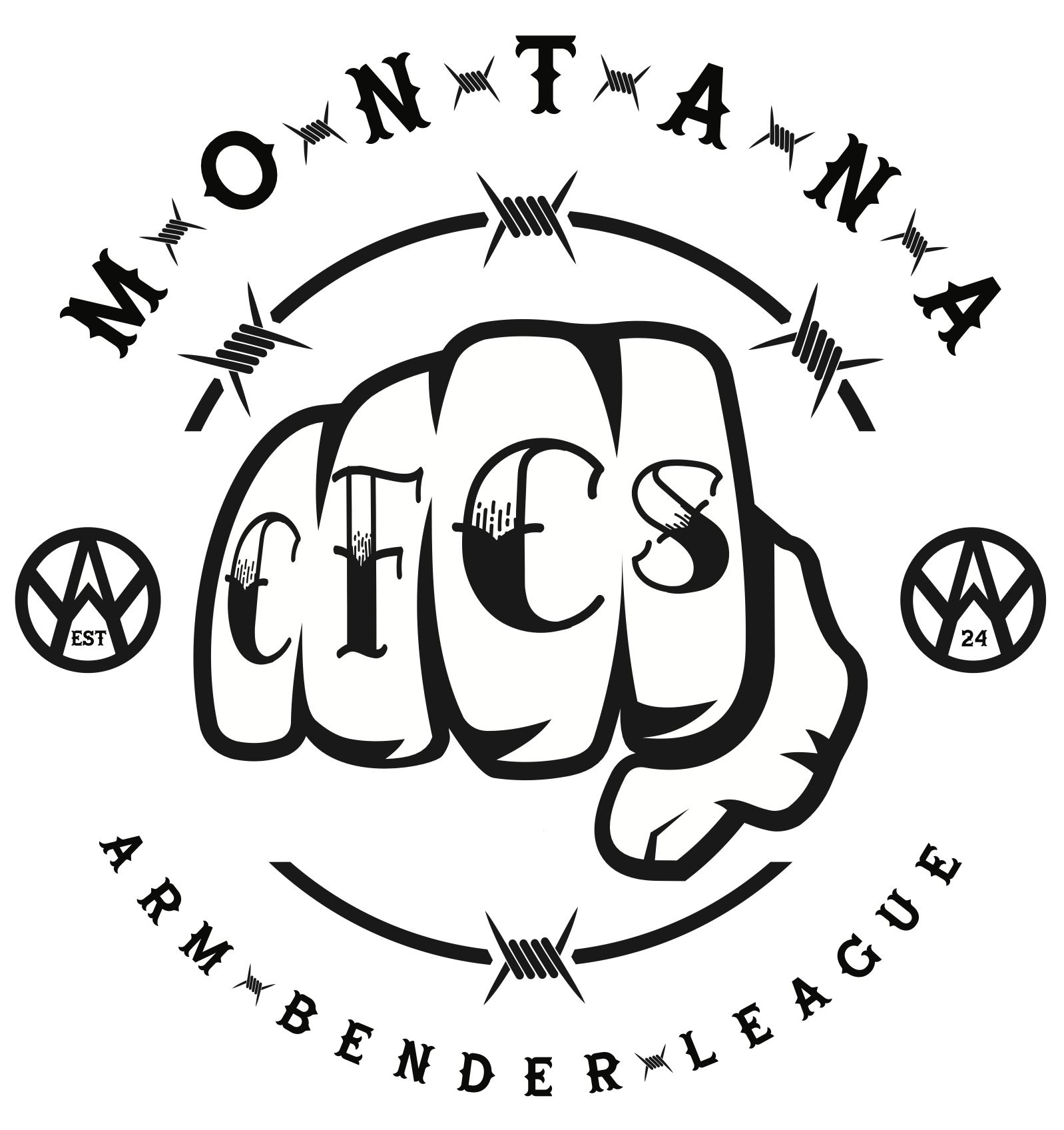
Taking the initial design of the logo made with vector art Josh from Josh Wood Photography made it into a 3D element for a more realistic and metal look.
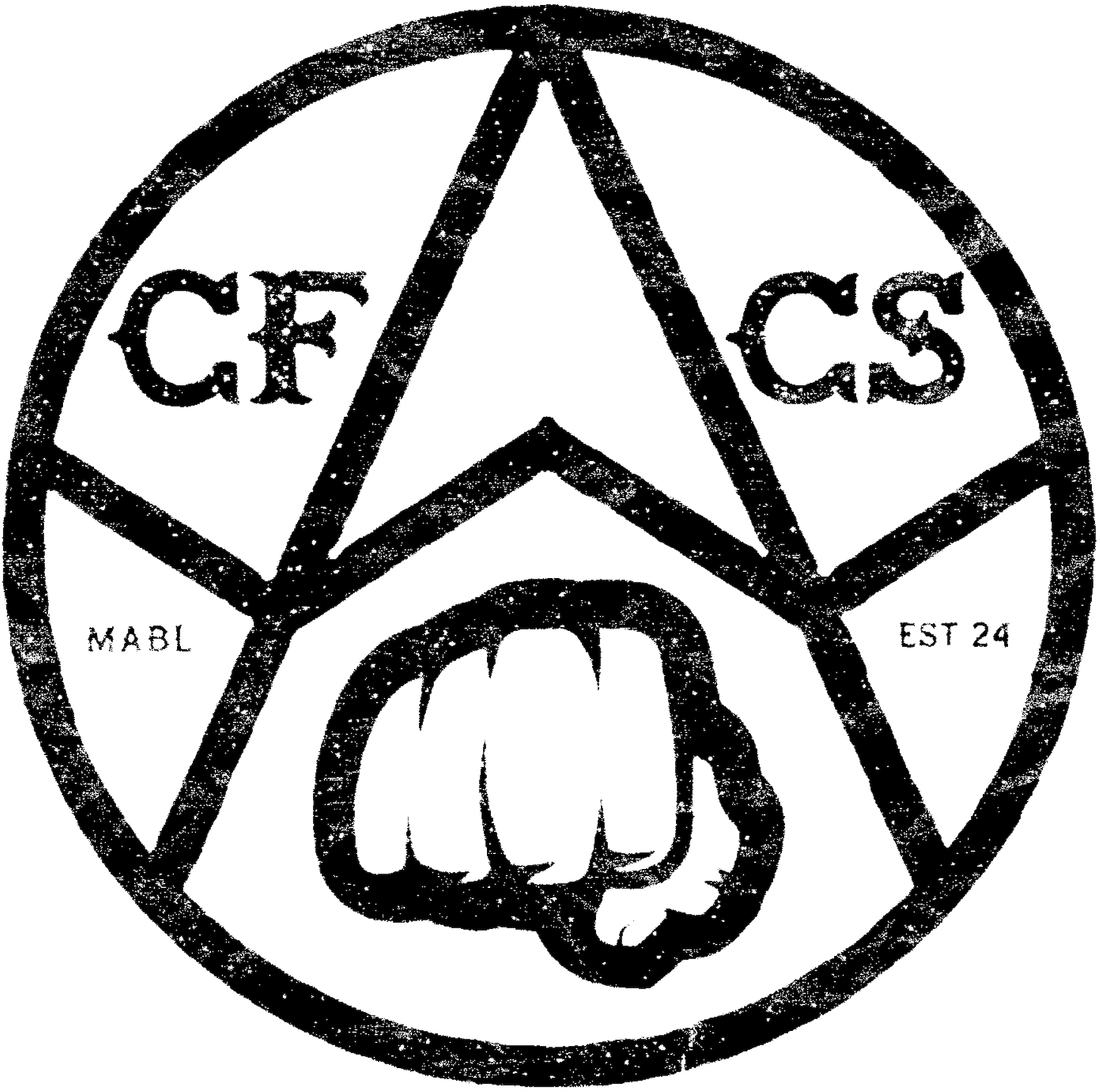
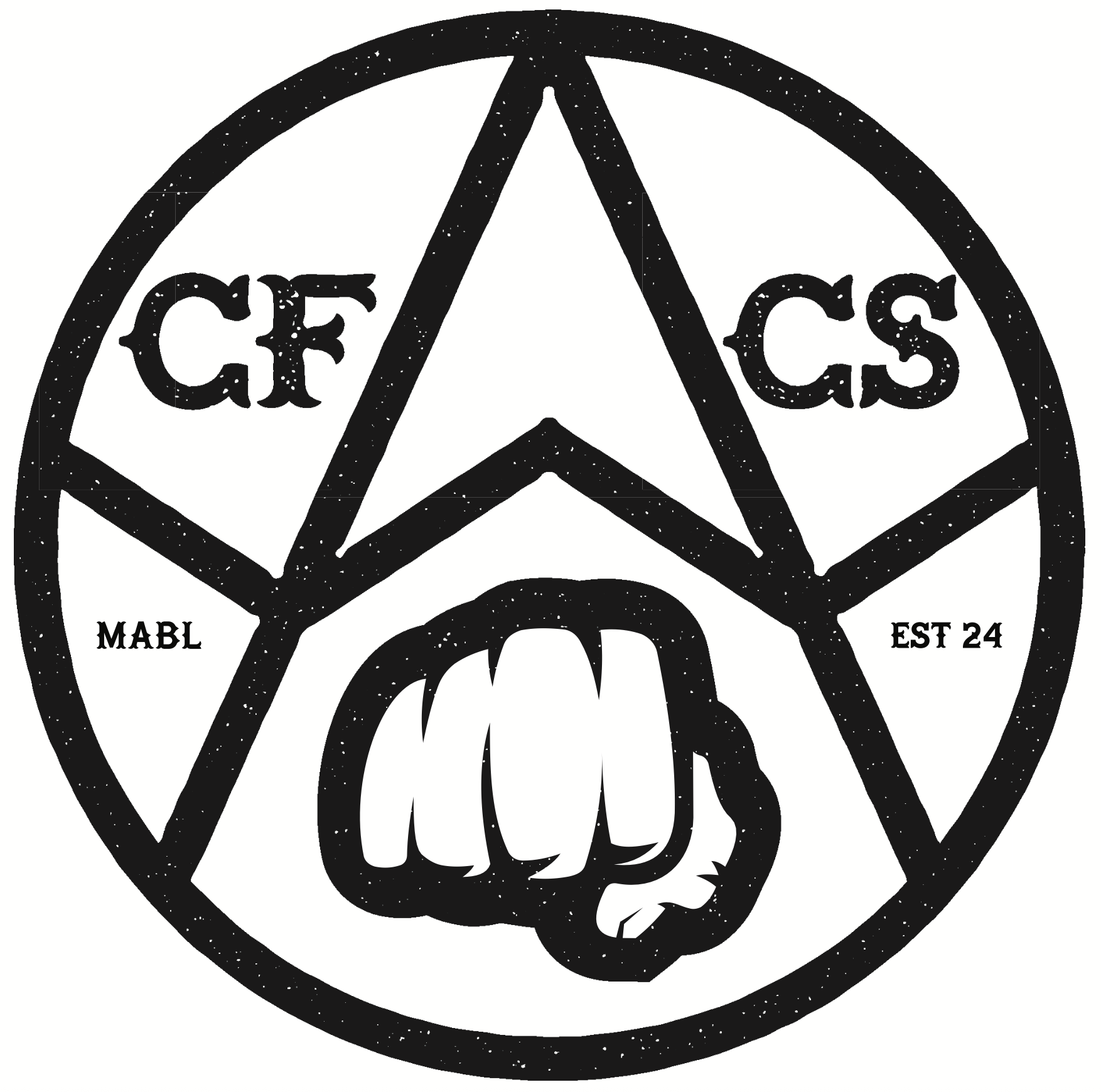
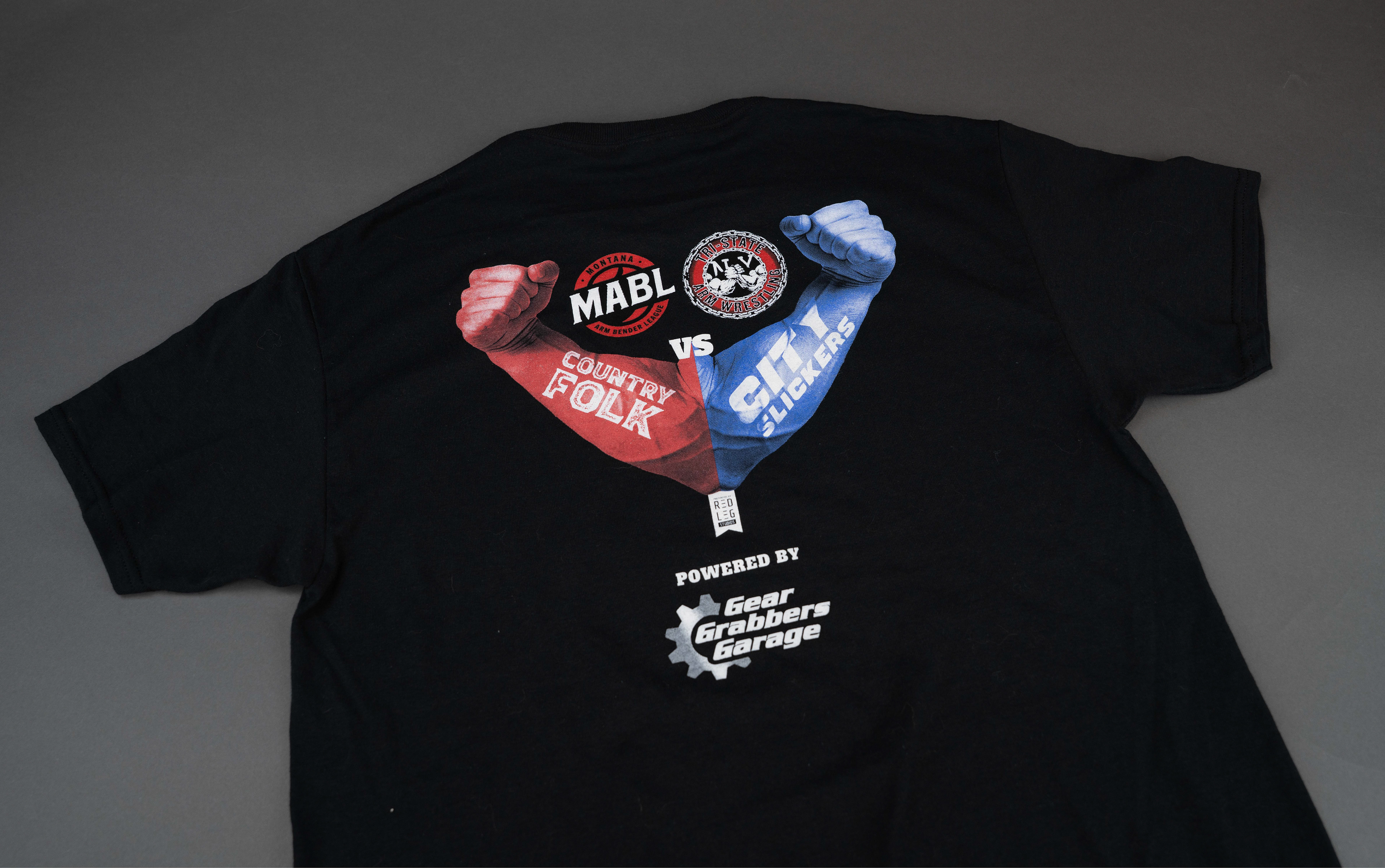
The secondary logo remained vector but then was given texture with the help of Jon Gelder from Orca Killer Creative to achieve a more iron material look.
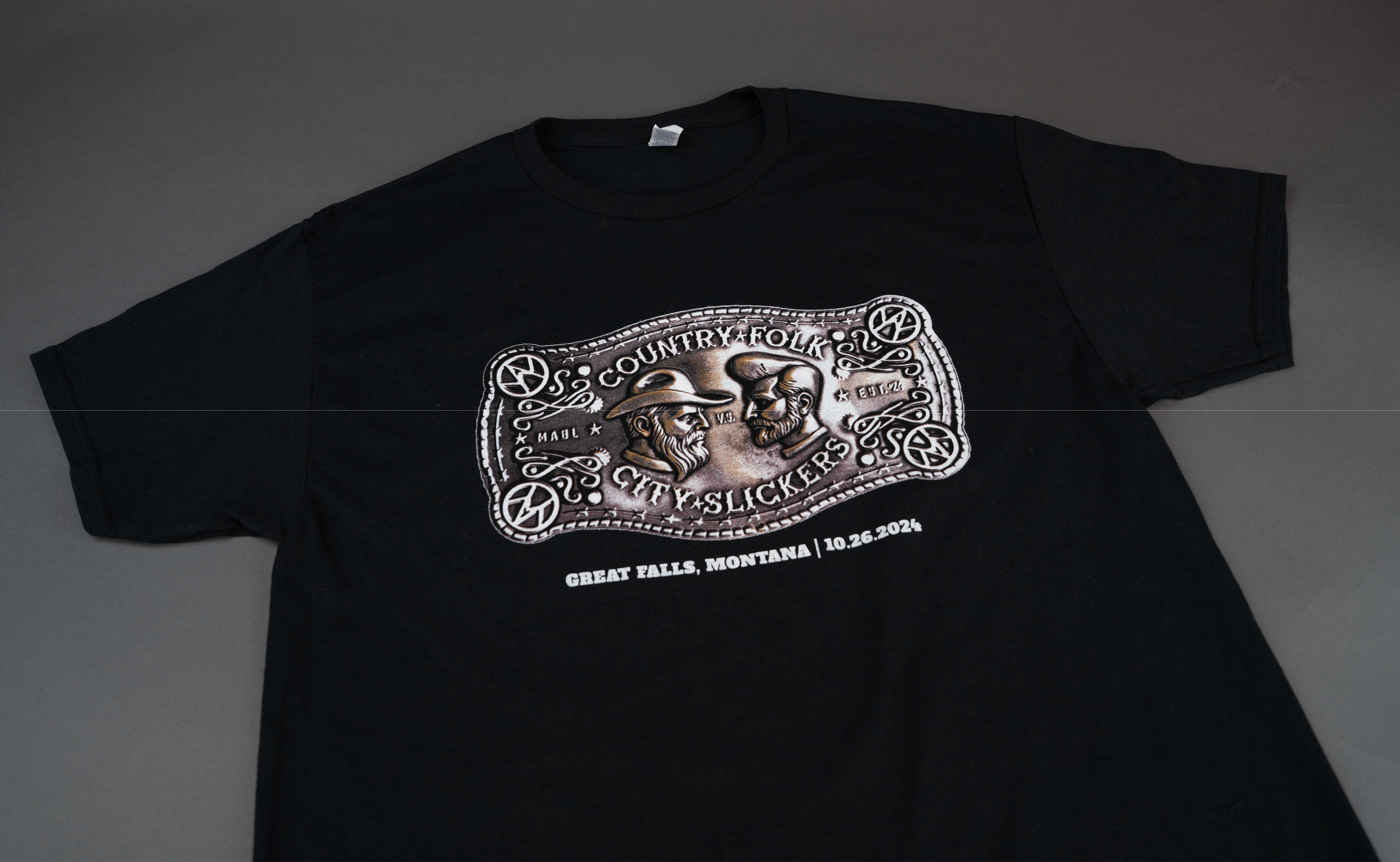
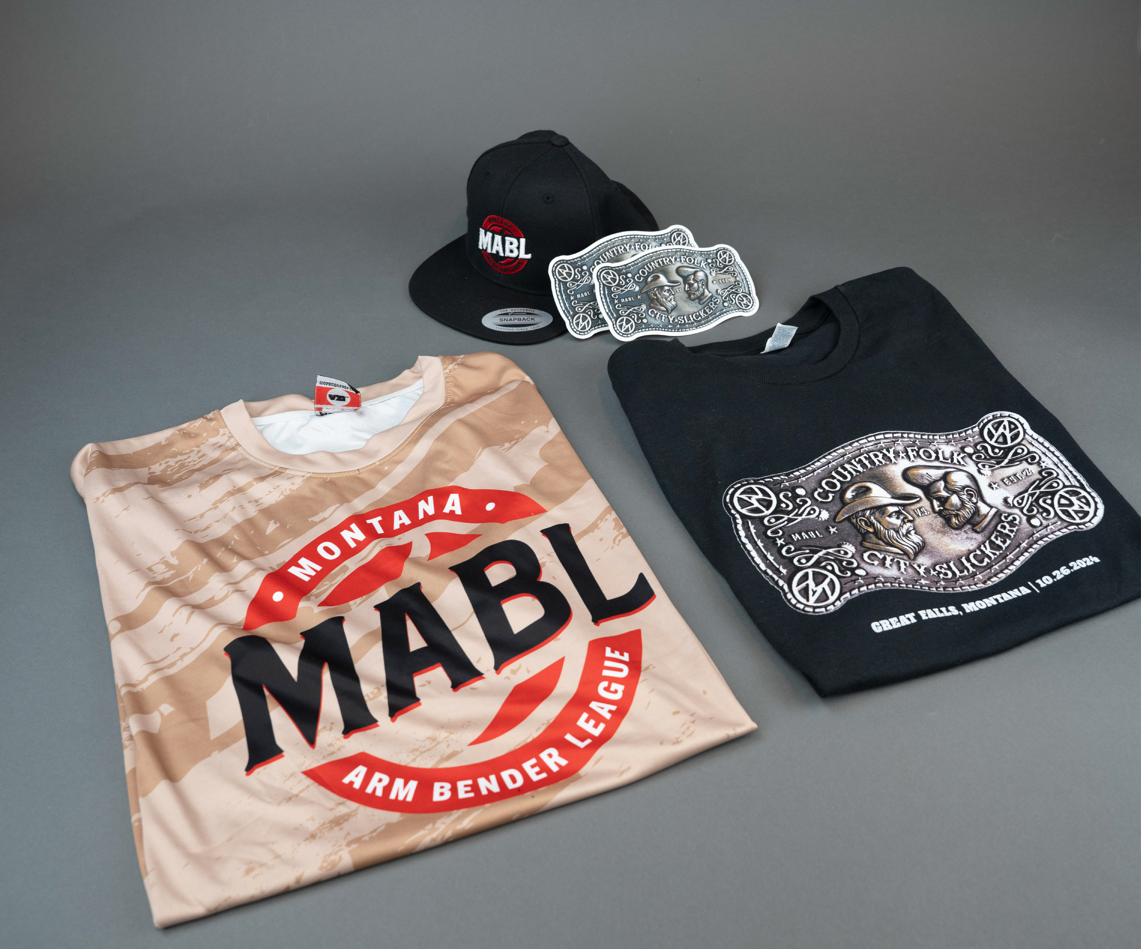
Thanks to the help of Orca Killer Creative, MABL, Ashleigh Hughes, and Josh Woods Photography the Country Folk vs City Slickers now have a logo, merchandise, as well as collateral for the event.
Collaborator links